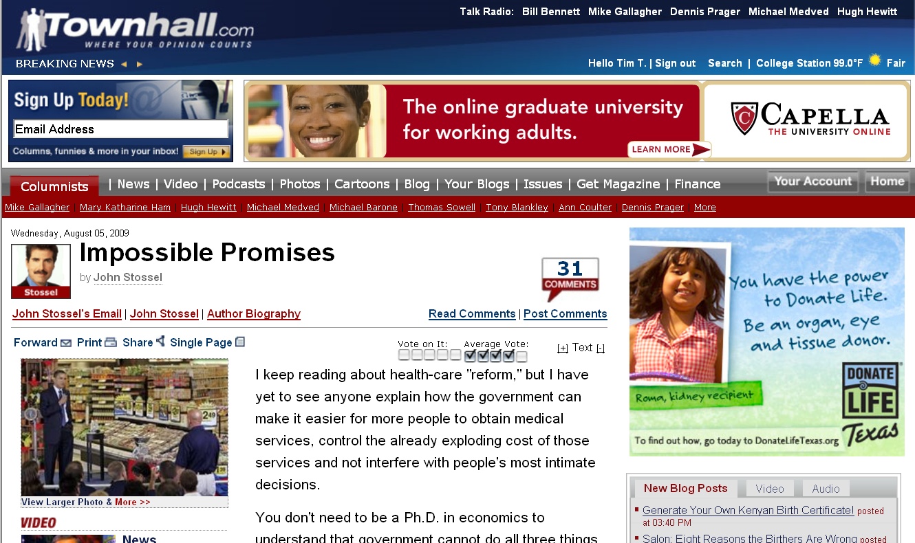
I’m sure there are others, but I normally have cause to visit Townhall.com every day, and in my opinion, few news/opinion websites are as difficult to read as that one. Here’s a random screenshot taken today:

Click the image to view it full-sized, or go to the page itself to get the full effect.
Visually, the page is a riot of images and color. An unreasonable amount of time is required to find the text that the page was created for. Once reading, the reader’s eyes are continually hijacked by the oversized animated ads surrounding the text.
I found one flaw in Townhall’s evil design scheme: As soon as I arrive at the desired page, I can immediately go to the print view, which is far less cluttered and far more readable.
Townhall has one of the best daily collections of conservative opinion; that’s the only reason I go through the trouble to visit at all.
What do you think? Are any other high-profile conservative websites worthy of inclusion in the Web Design Hall of Shame?
